SnapCheck
Redesigning SnapCheck responsive web app version 5.0.
Overview
SnapCheck is paperless digital check technology for B2B electronic check payments. Providing fast, secure, cost-effective paperless check payments for the enterprise.
The goal of this project was to create a new web app interface that leverages the banking experience through a new visual style and modern design system.
Timeline
6 Months
Methods
In-Person & Remote Studies, Card Sorting, Iterative Testing
Tools
Figma, Canva, Octopus
Timeline
6 Months
Team
Design Team Luna Mok, Michelle Gao
CEO Ken Kruszka
CTO Ajay Singh
Front-end Engineer< span>Emily Yu
QA Engineer Shabana Shaikh
Methods
In-Person & Remote Studies, Card Sorting, Iterative Testing
Tools
Figma, Canva, Octopus
Methods
In-Person & Remote Studies, Card Sorting, Iterative Testing
Tools
Figma, Canva, Octopus
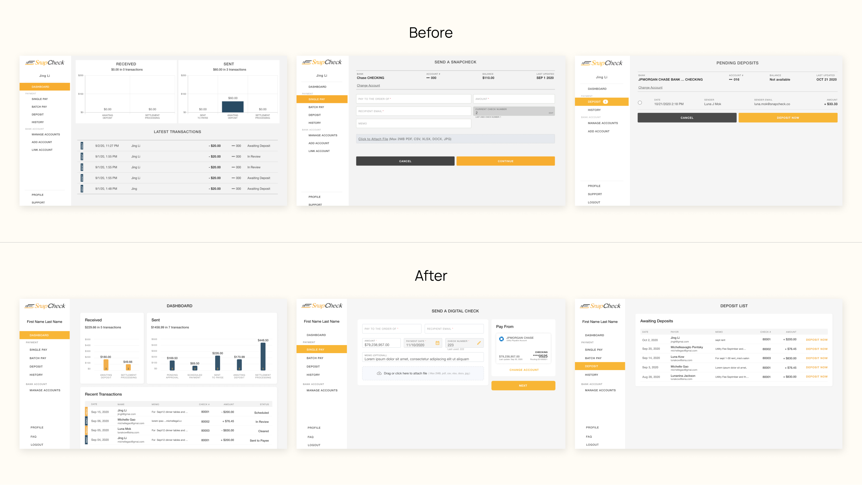
Elevate From Version 4.0 to 5.0.
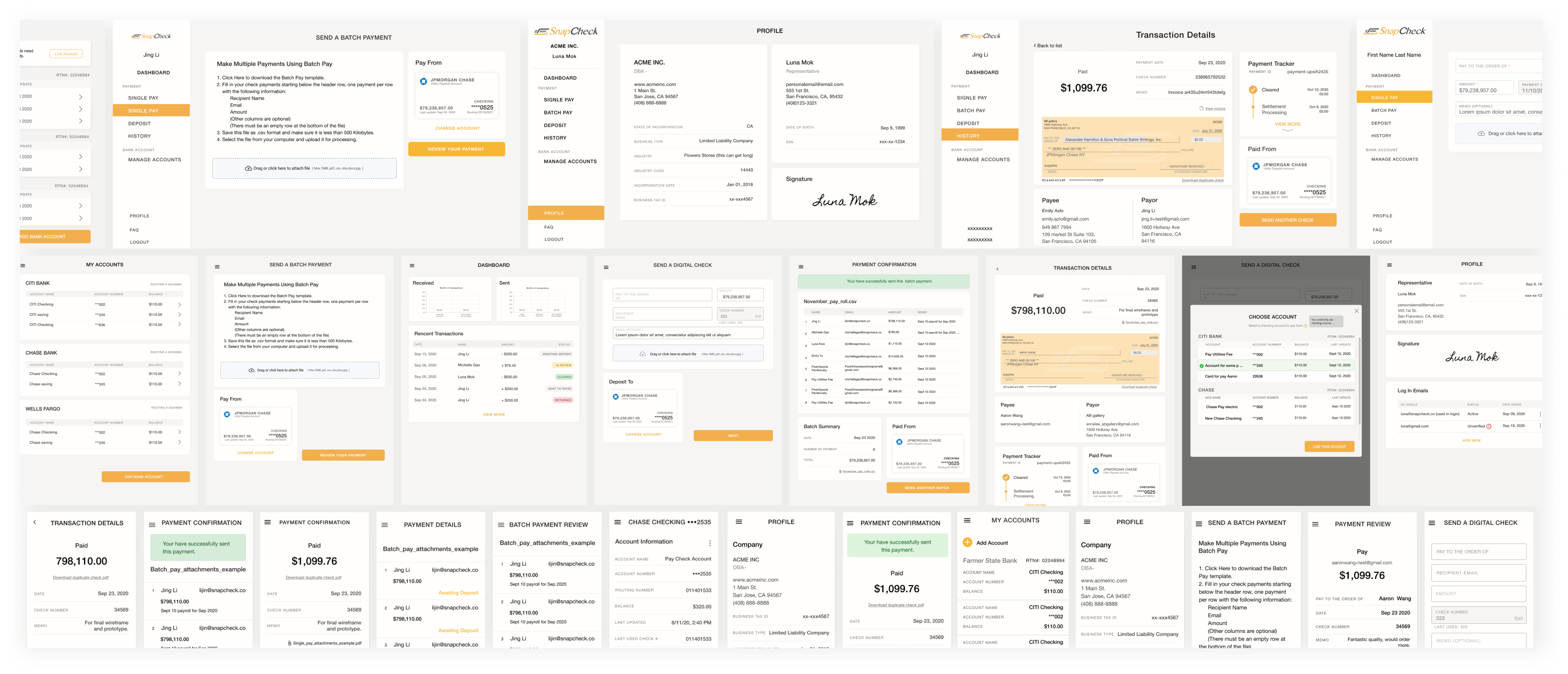
First let's take a look at some screenshots, include the Dashboard, Single pay form, Batch pay, Deposit, History, and Profile. Current version 4.0 has an old-fashion style of an accounting system right? The product owner agrees with that LOL.
Putting all information without considering one principal.
It's a common problem when we design a page of content either physical or digital. All of the information and new features get added over the versions, but it's never consider to organize well like group, section, and overall experience.
When in Doubt Just Throw it on the page with a line break.
Results? Busy and confusing pages that frustrated users and our partners.

Some examples illustrate the problem.
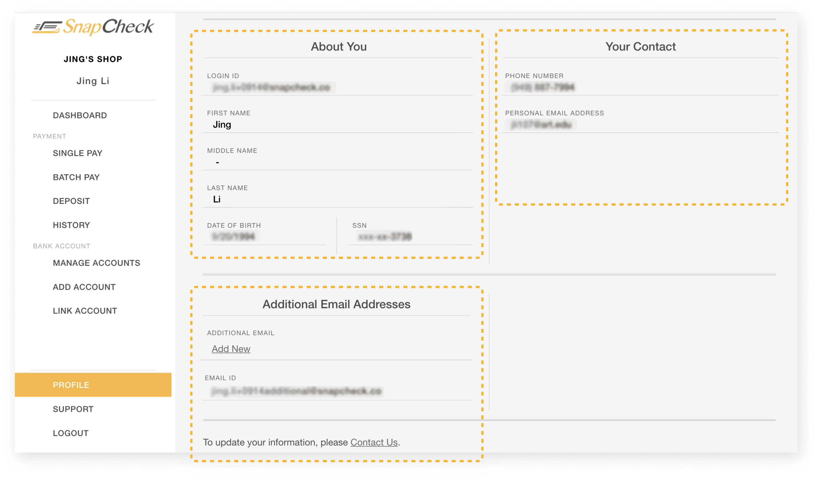
How do I check the email address of my past transactions?
-
Click to jump to History Page
-
Click the payment you want to check
-
Scroll down down down to find the recipient email address
Ok, when you have 50 or more orders, you might not willing to scroll down 50 times to see important information, right?
Issues about account management?
"How these two pages under BANK ACCOUNT look different?"
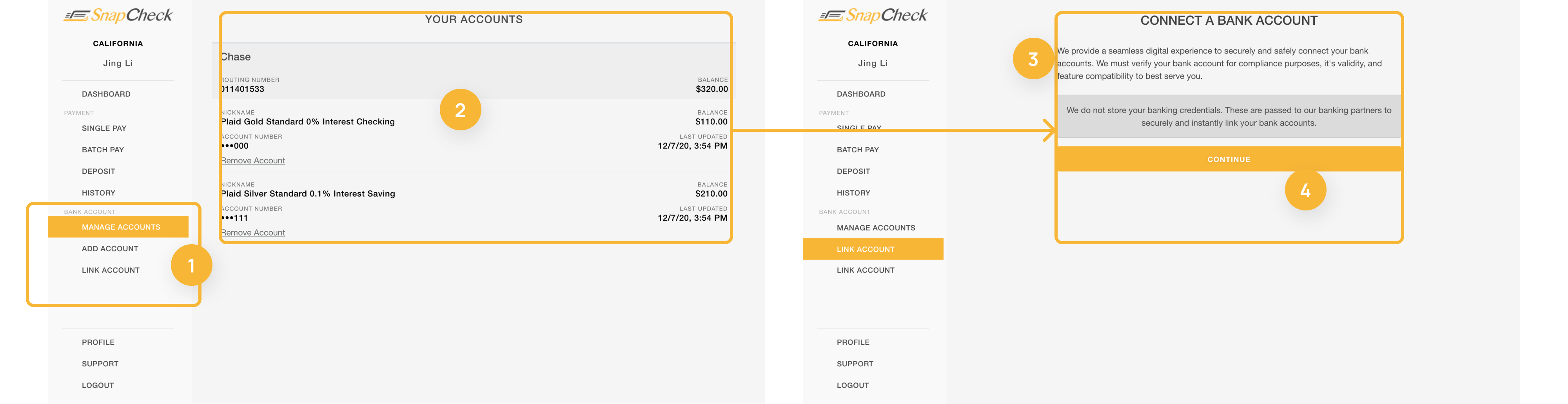
-
In navbar, we have to Manage Account in the bank account section, and then we also have repeat Add Bank and Link Bank listed below?
-
Account profile is blended in the background canvas?
-
Content width difference on pages under the same group has no reason.
-
The primary call-to-action button seems to have full width with whatever screen.
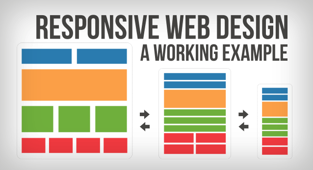
Why Responsive Web App?
They’re important to users and the business.
-
Most business users use this on the desktop browser during office time.
-
Medium to low cost, web apps can be built in a shorter period, and easier to maintain.
-
Web apps need an active internet connection to run, make sense for our money-involved business.
-
Responsive web apps give users choice, especially for small business owners.
What other enterprises do with their web applications?
As a team, we knew that the movement was in information grouping, AKA card design, but we needed to gather good examples and see what other enterprises do.
To get everyone on board, we gathered some good references that demonstrate some key points and insights:
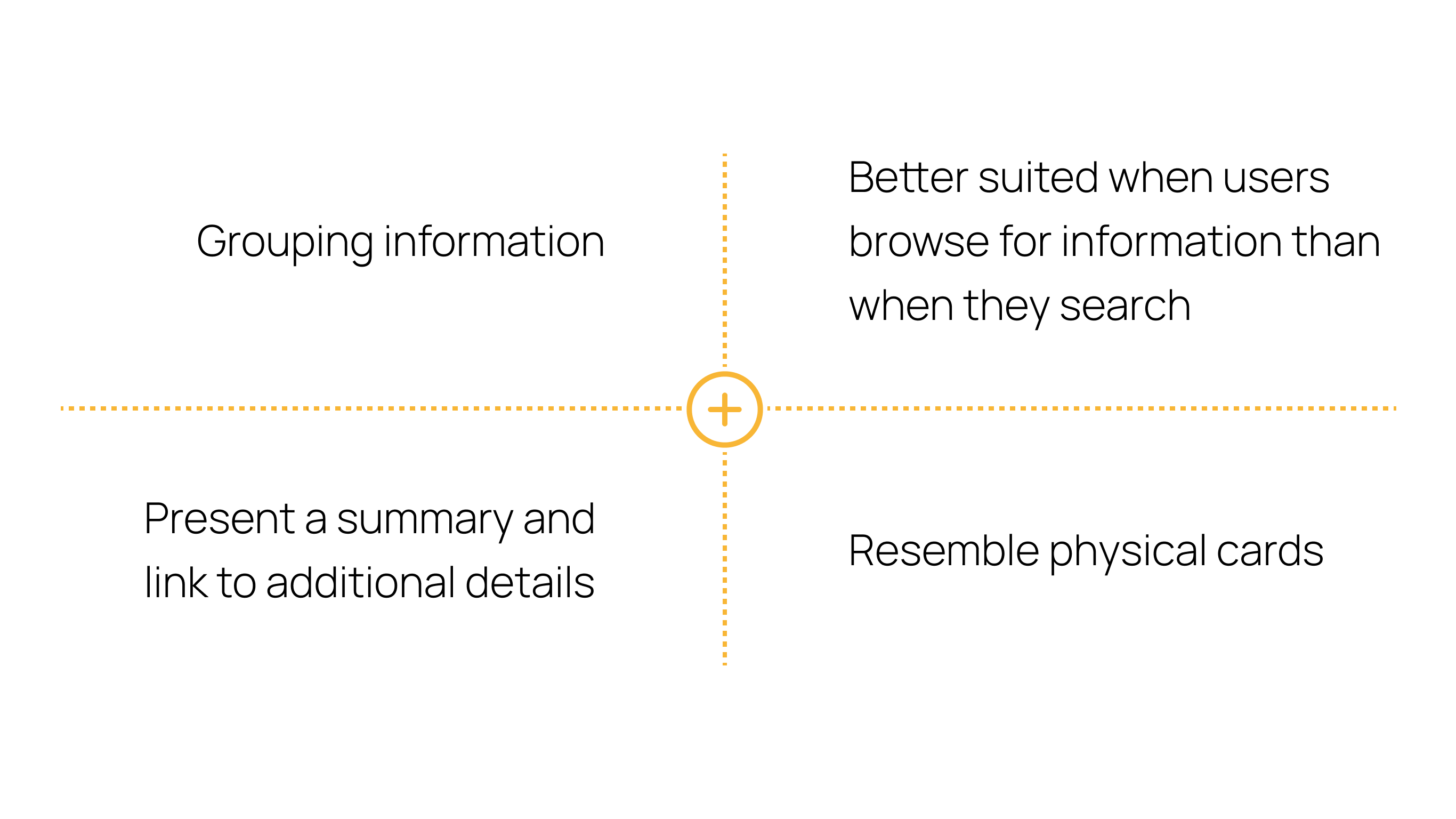
Card design works better for grouping information & collections of heterogeneous items.
With cards, users can effectively scan the whole page to see content that not all are of the same basic type and media together.
Each card presents a summary and link to additional details.
Cards allow for flexible & responsive layouts.
Cards are easier to visually use a column grid, which is popular in HTML5, like modules or blocks on a page.
Cards with a style system make web apps keep consistent in a natural way.

Cards Have 4 Key Properties that Boost the Business:
Card design received a lot of attention in the software-design world, with many high-profile sites and companies (e.g., Google’s Material Design, Twitter's card component) embracing them and more following.

What do we want to achieve about this project? and constrains?
We lined up the team, we defined the problem and direction to go, now it's time to begin the down to earth work.
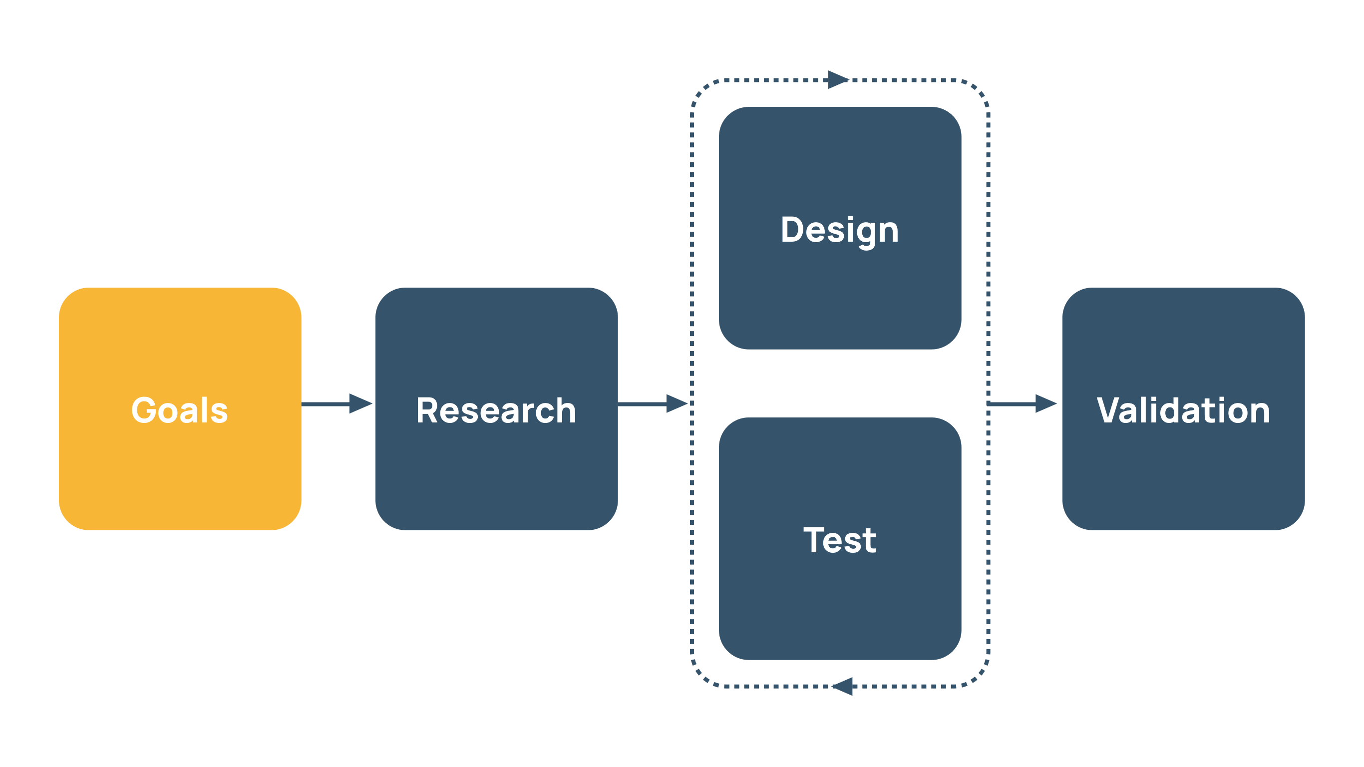
With settled goals of the project, our cross-functional team has an agreement about what we want to achieve when we finish this project, and helps a lot about focusing the key points while we exploring and brain-storming.
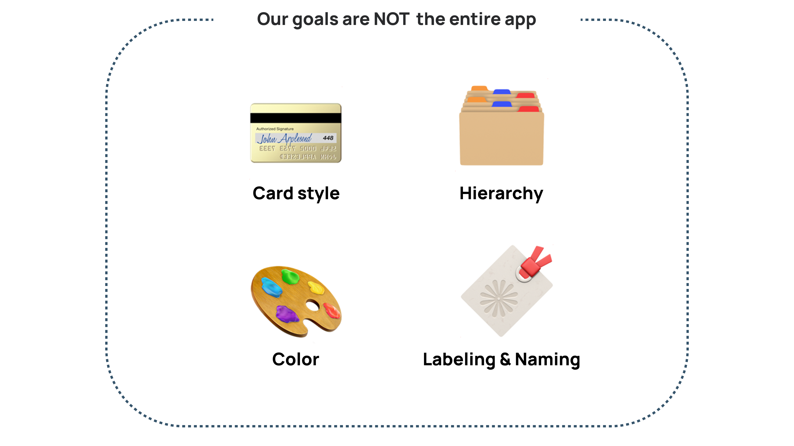
Main Goals:
-
Reorganize page structure with card-style components.
-
Revamp pages to a better visual hierarchy.
Side Goals:
-
Enhance the color using based on the new brand style guide.
-
Improve section & category naming.
This will help the team during the design process that we are not redesigning the whole app like NAV var, payment & deposit workflows.
How could we find and interact with our users?
-
As a start-up with a small team, we don't have a User Researcher to look for help.
-
As a 2B web app, we don't have many end users we could interviewing and get feedback.
How might we just start brainstorming and throw ideas on the table?
We knew that only doing research was the right way to further develop a good design, and then we followed a reasonable research path and tried our best to collect information.
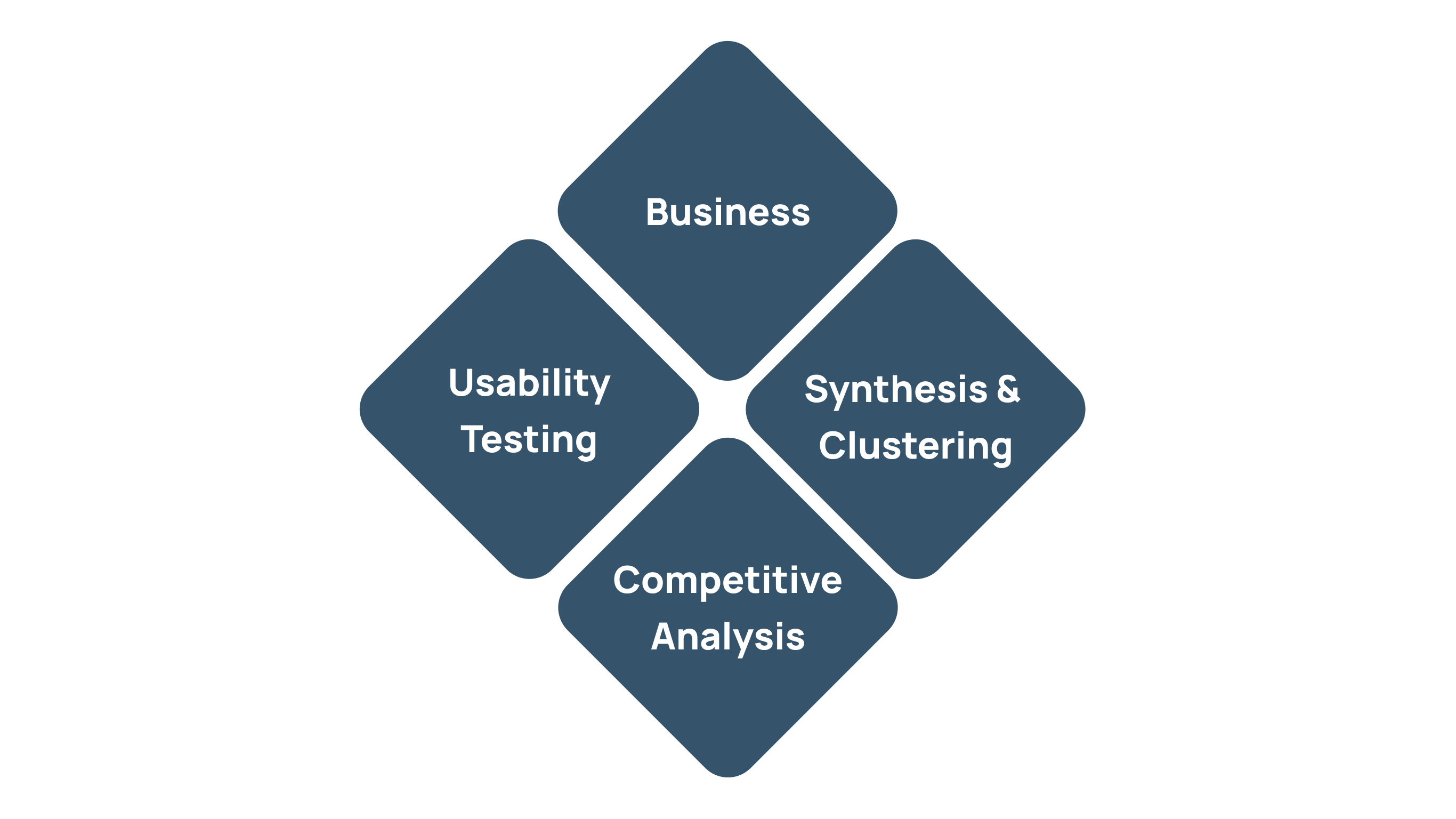
What do users really need and what could we learn from them?
Despite we are not very easy to get to end business enterprise users, we have connected some secondary users(Accounting Specialist & Small Business Owners), as well as our just on-boarding colleagues to explore some of:
-
our web app (Desktop & Mobile).
-
competitor's products.
-
any related feature or app we could learn.
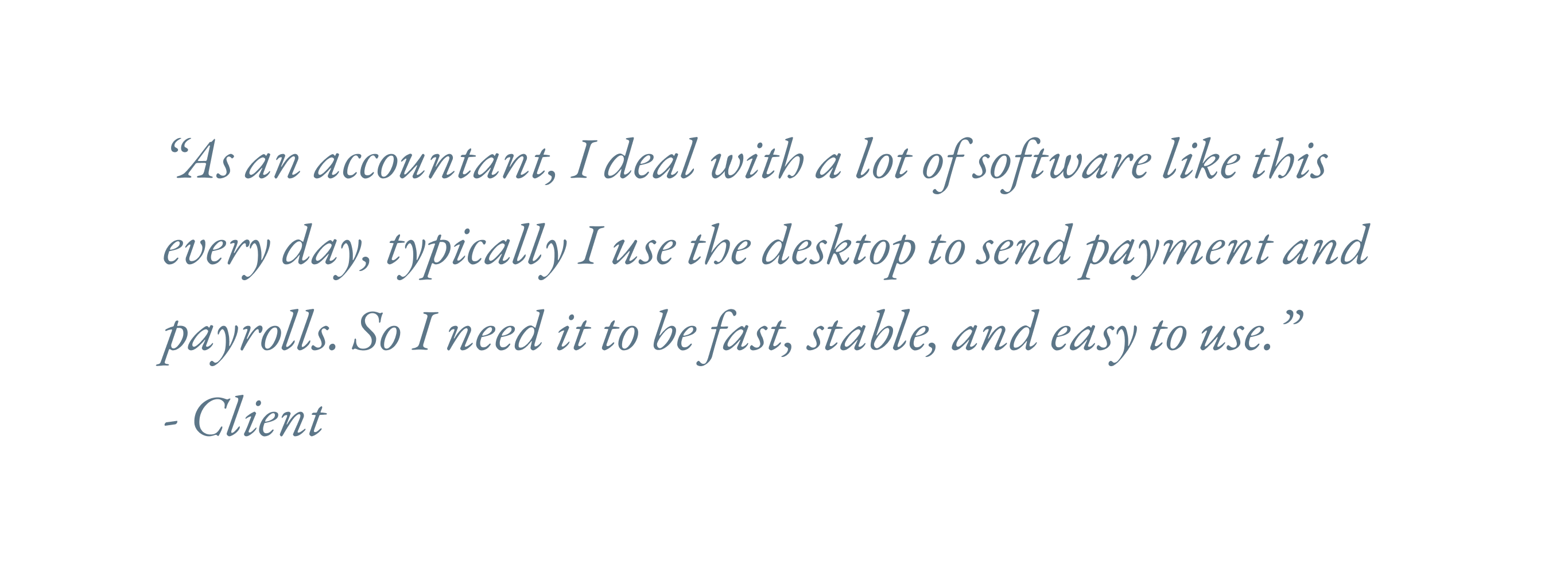
Our business users like to " snap " a check.
Most users would like to finish their tasks smoothly and fast every time.
They come to pay a single recipient, do payroll, or confirm deposits.
Users got lost in a long list of plain text.
Users were easy to lose when they browsing a bord list of numbers and text, lack of visual hierarchy was slowing down their task.
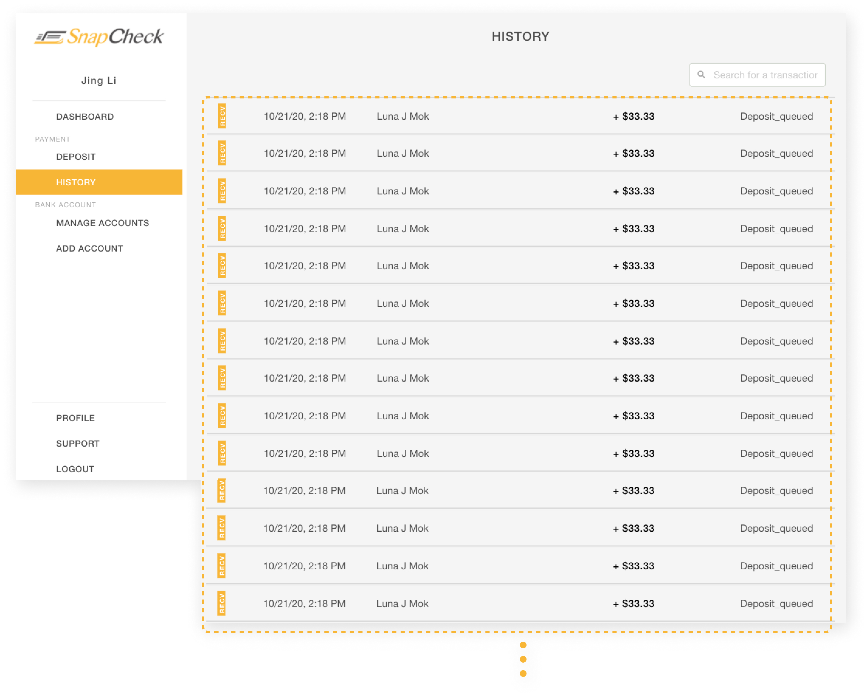
Imagine a user has 200+ past transactions, how could they browse & find a payment? Just scroll down to the end of the world?
What matters when we browse the transaction details?
To know more about the details about screens and task flows. We extracted two key screens (Dashboard & TXN Details page) and let users give feedback.
We took the Transaction Details page as an example to show the patterns. And then let them try to list out the feed they want to see priority high to low.
Some initial patterns came out:
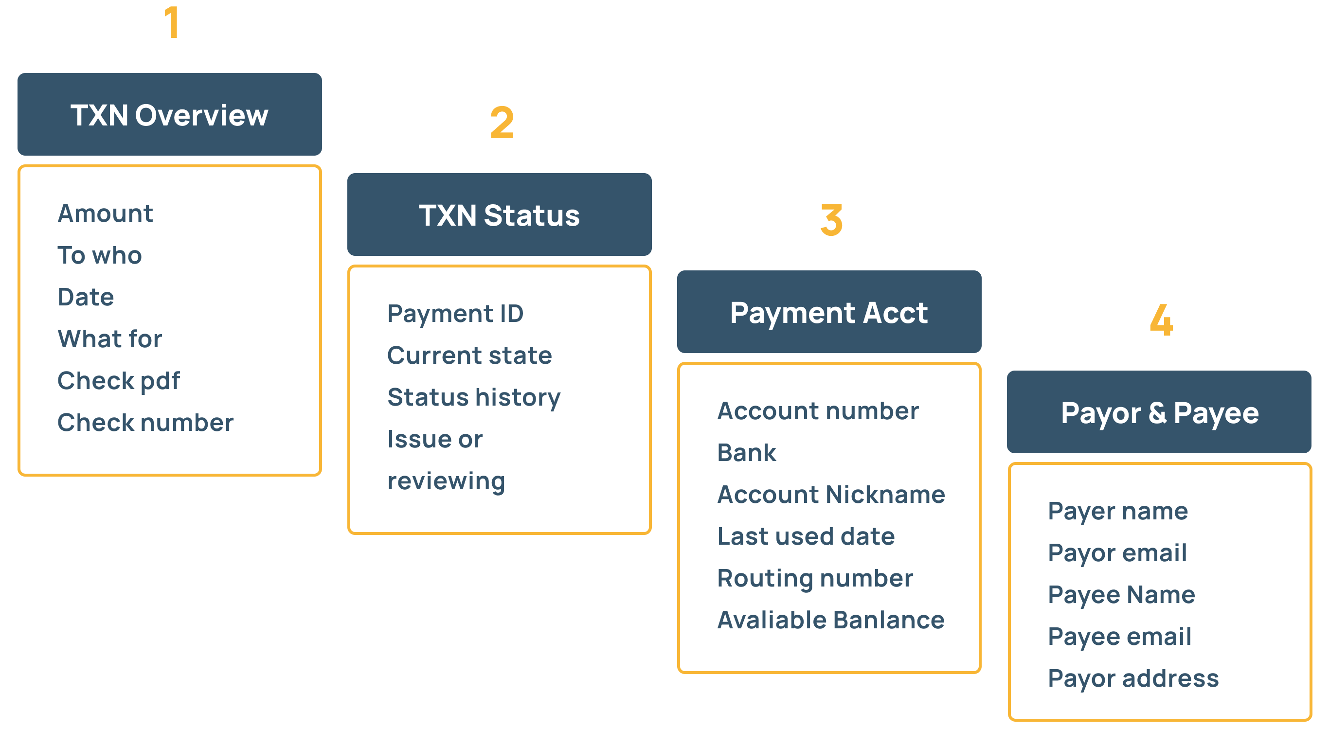
This cart sorting shows that the user would like to know the most is the overview of the transaction as well as the payment status, followed by the payment account info and payor & payee info. It"s extremely helpful to group information to the next step.
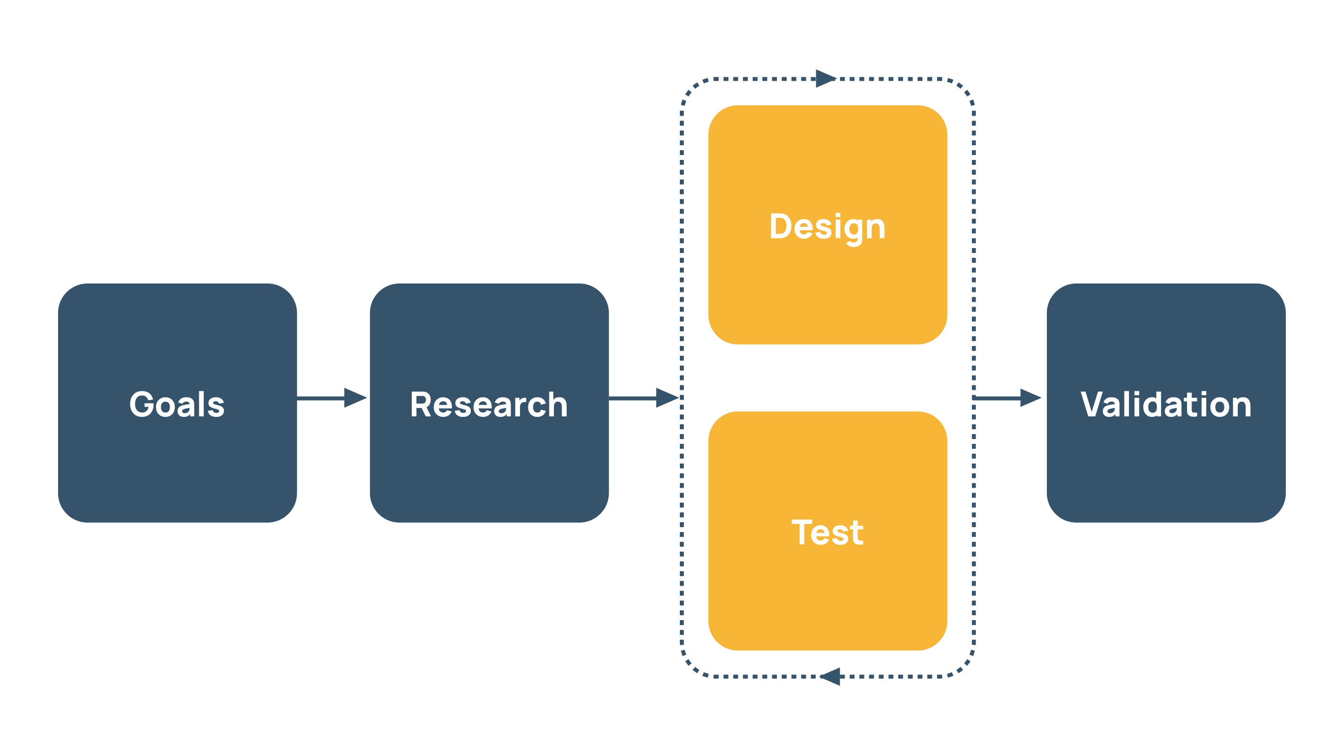
Time to transform insights into solutions.
We created a long list of ideas for research insights and design patterns to explore. Like:
-
Should account selector be on the top as a full-width widget of use column grid?
-
Should payment-related screens have a progress indicator?
-
How does the success message appearance be most reasonable for users?
Some Initial Ideas
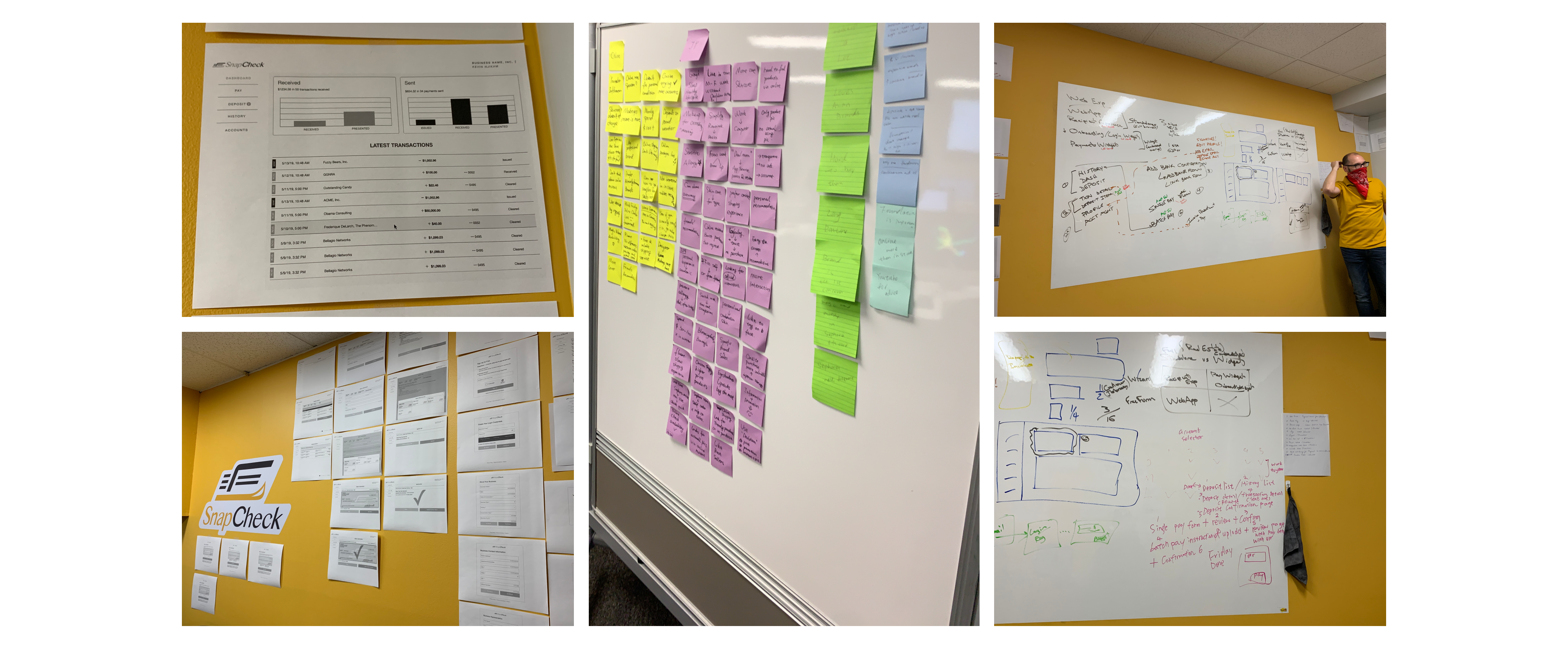
We take the research insights and patterns to the whiteboard and markers to brainstorm and explore some ideas and layouts.
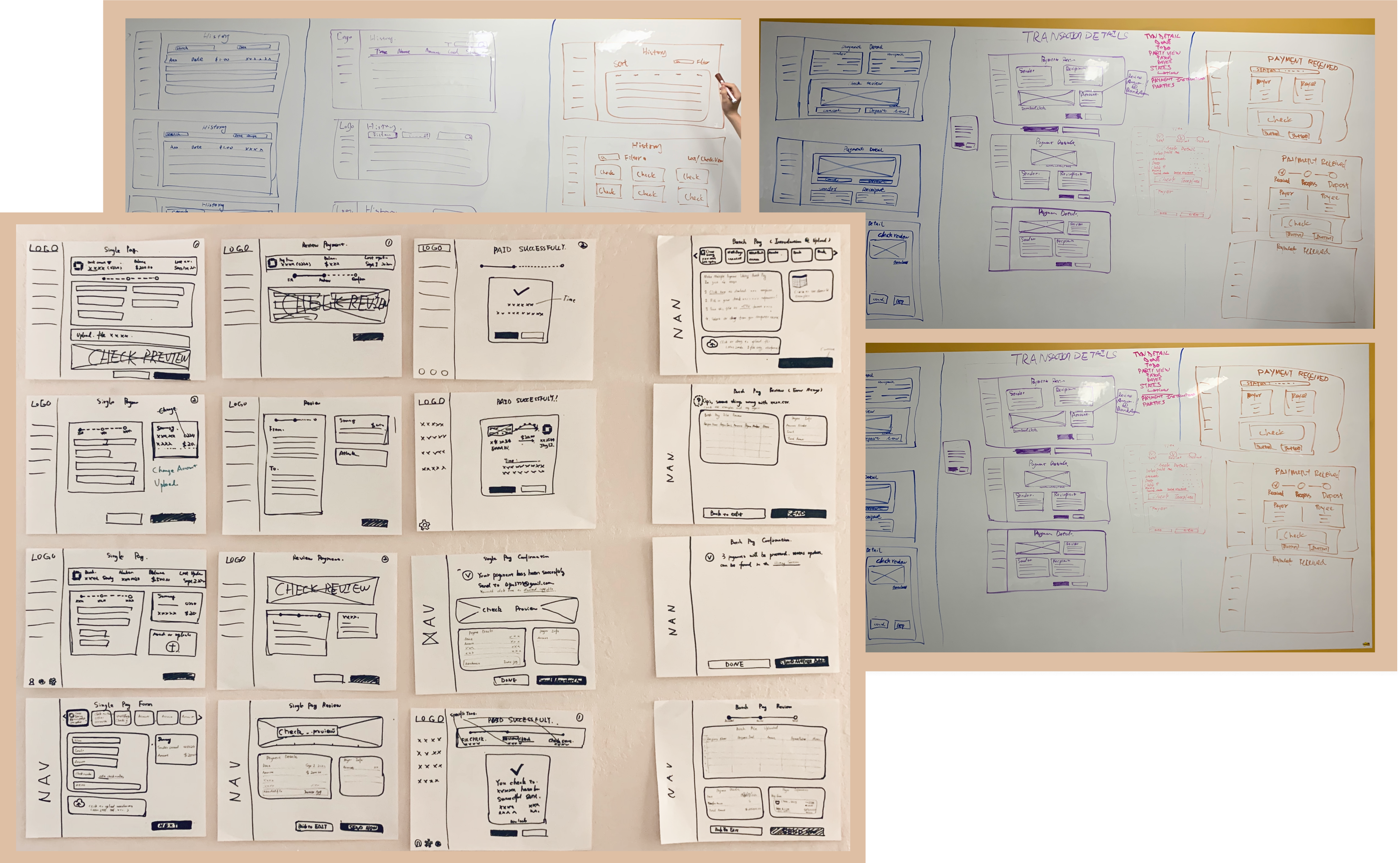
Level up to Digital Mid-Fidelity Wireframes
We moved out paper-pen sketches into digital wireframes to show the team and testers, designing each to give an overall feeling about the screens.
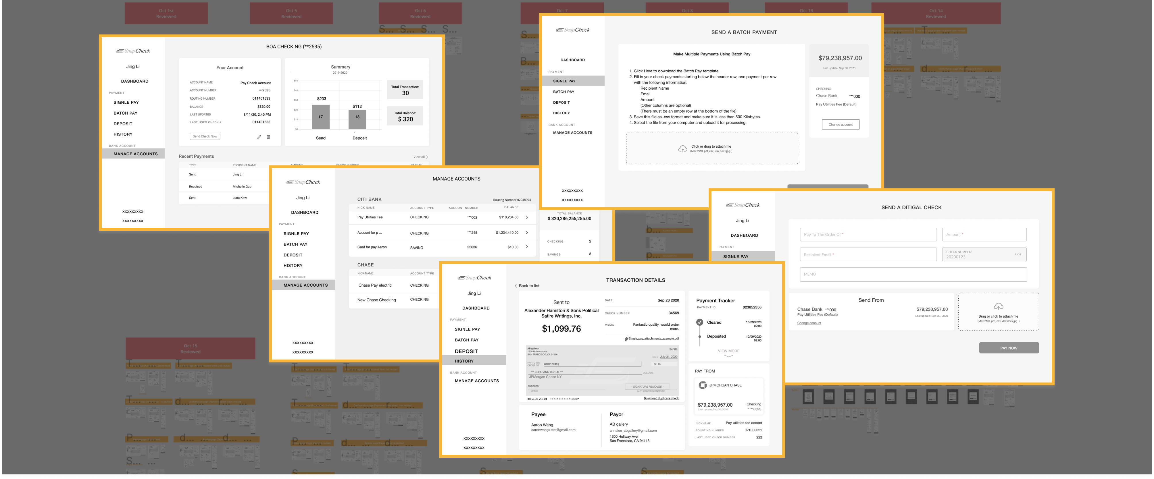
Hi-fidelity Wireframes, 4 Rounds of Usability Testing
As we keep design, test & iterate, We leveraged our wireframes to high-fidelity to make users feel like using the real app and get feedback, sometimes users wouldn't focus or easy to miss if the wireframes are too sketchy.
We continued testing, tweaking, and improving until testers were able to complete all tasks smoothly & quickly.
Fresh, modern, and easy-to-use.
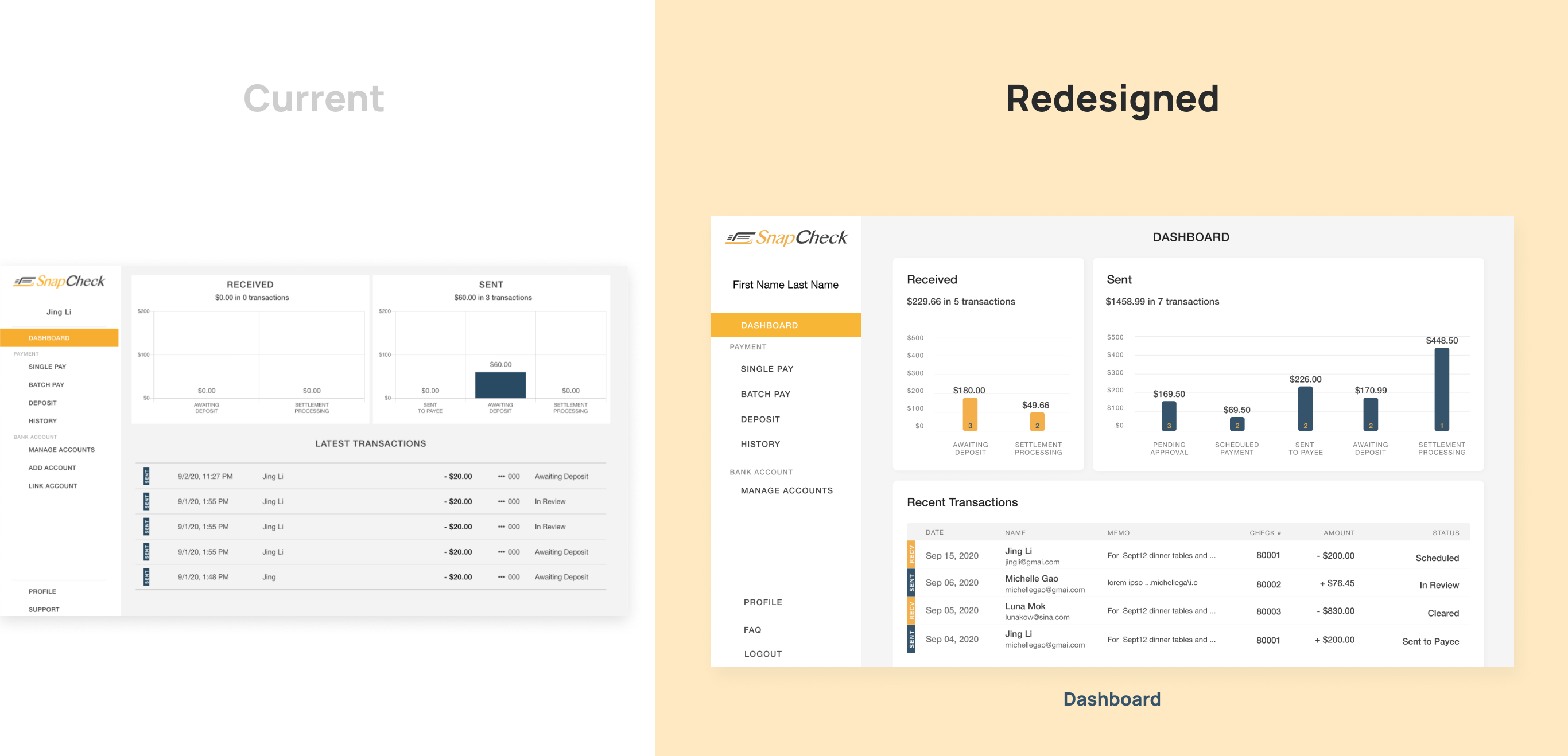
Current
-
Sent & Receive graphs use a white background, latest transactions use canvas background.
-
Columns of TXN status in each graph are not displayed completely.
Redesigned
-
Add all core status to display in graphs with matched brand color palate.
-
Apply our new consistent table list style throughout the web app.
-
Add memo of transactions to help users identify payments quickly.
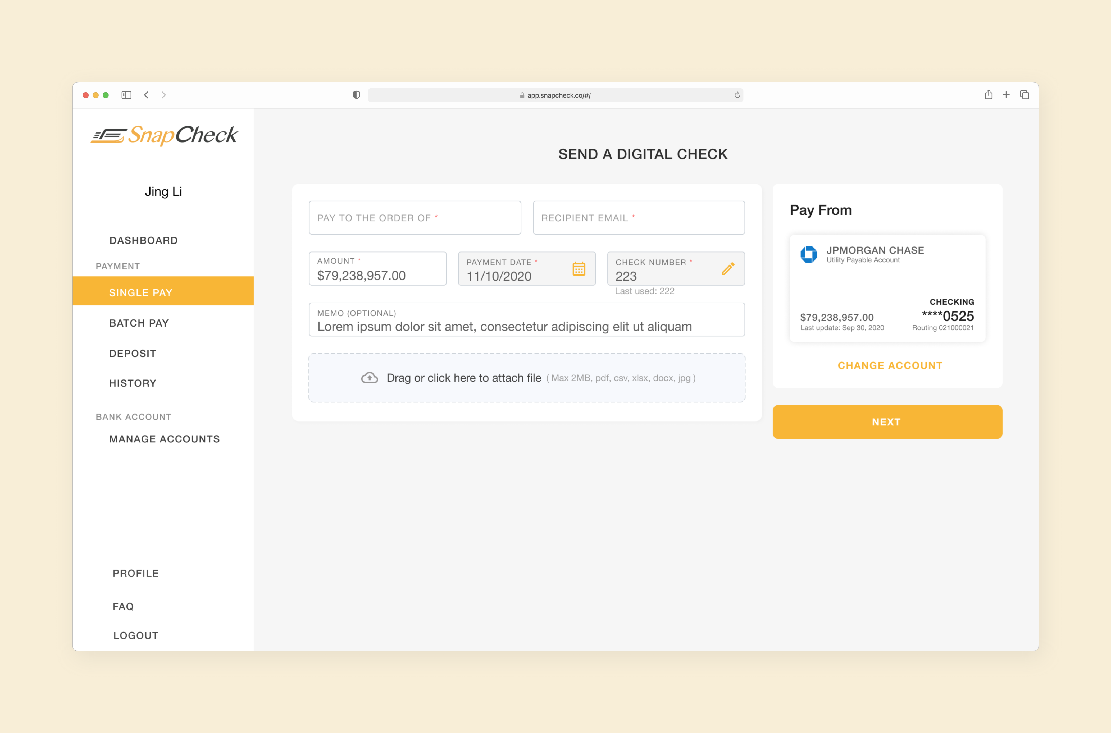
Single Payment Form: From Plain to Structured
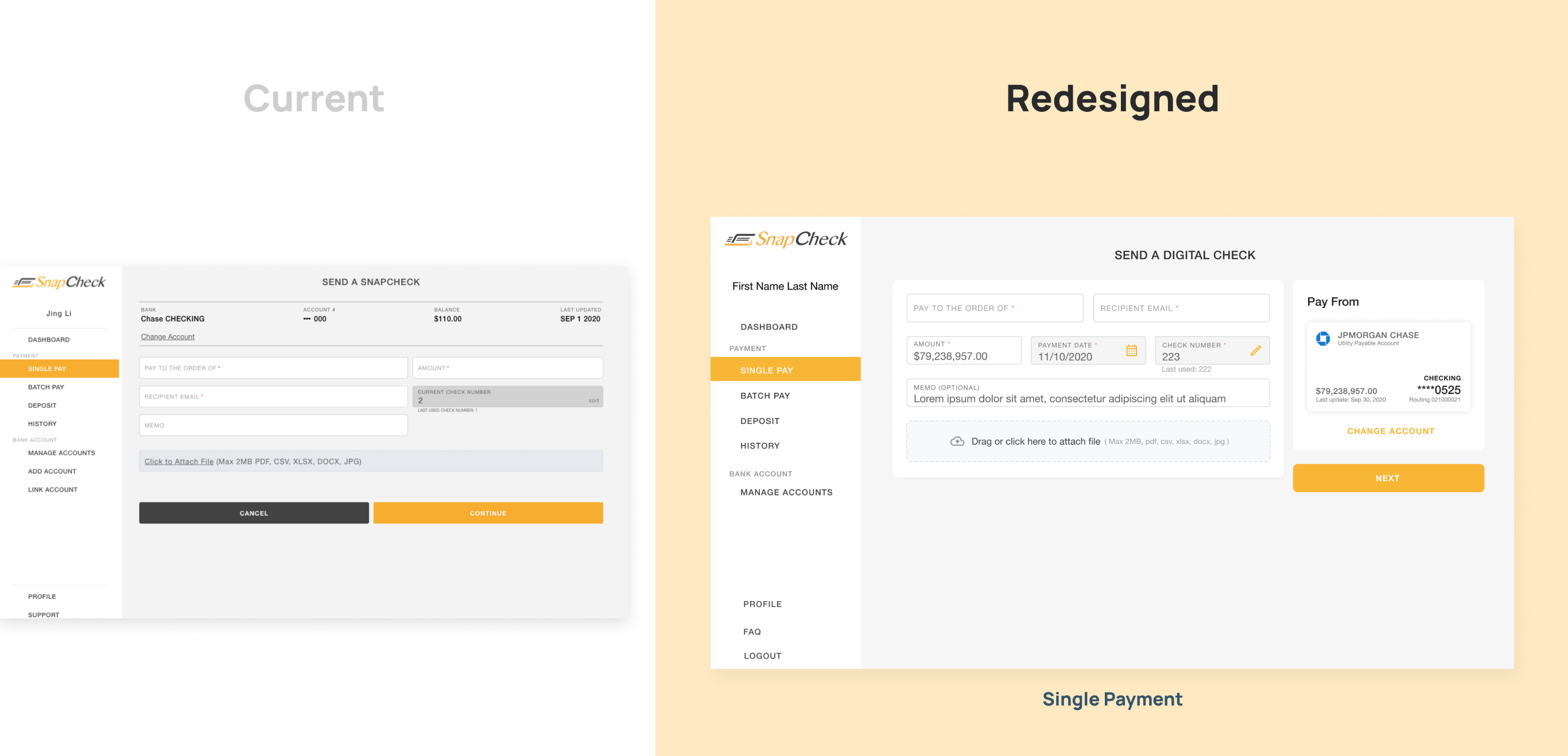
Current
-
Inputs are of different sizes and colors, file upload area is the same height as inputs.
-
CTA buttons are full width on the desktop.
-
Account selector is blended in the canvas background.
Redesigned
-
Form inputs are now as well as the whole page follows 12 columns grid, it's more organized and easy to adapted different screen size.
-
The file upload area has a larger space, icon, and support message to encourage users to add attachments correctly.
-
Payment account selector has bank icon, highly visualized card style with better information hierarchy.
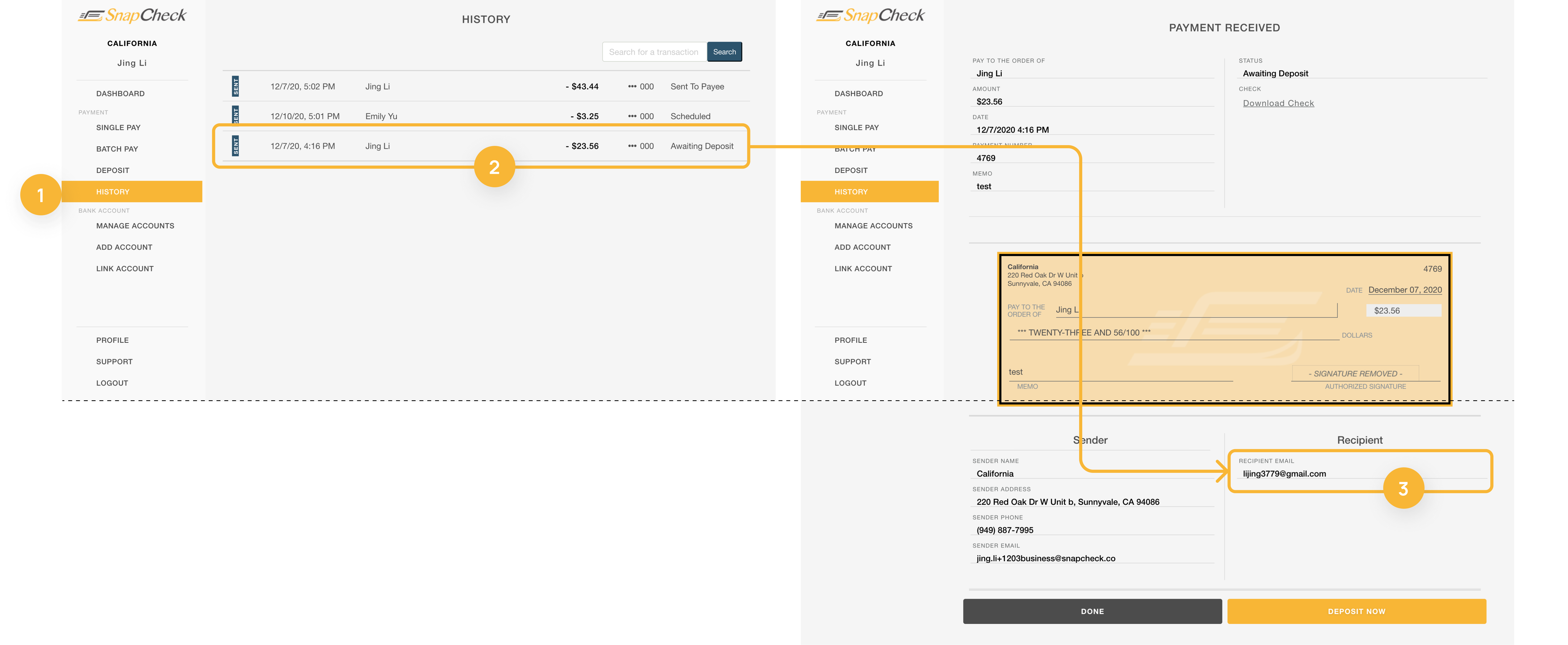
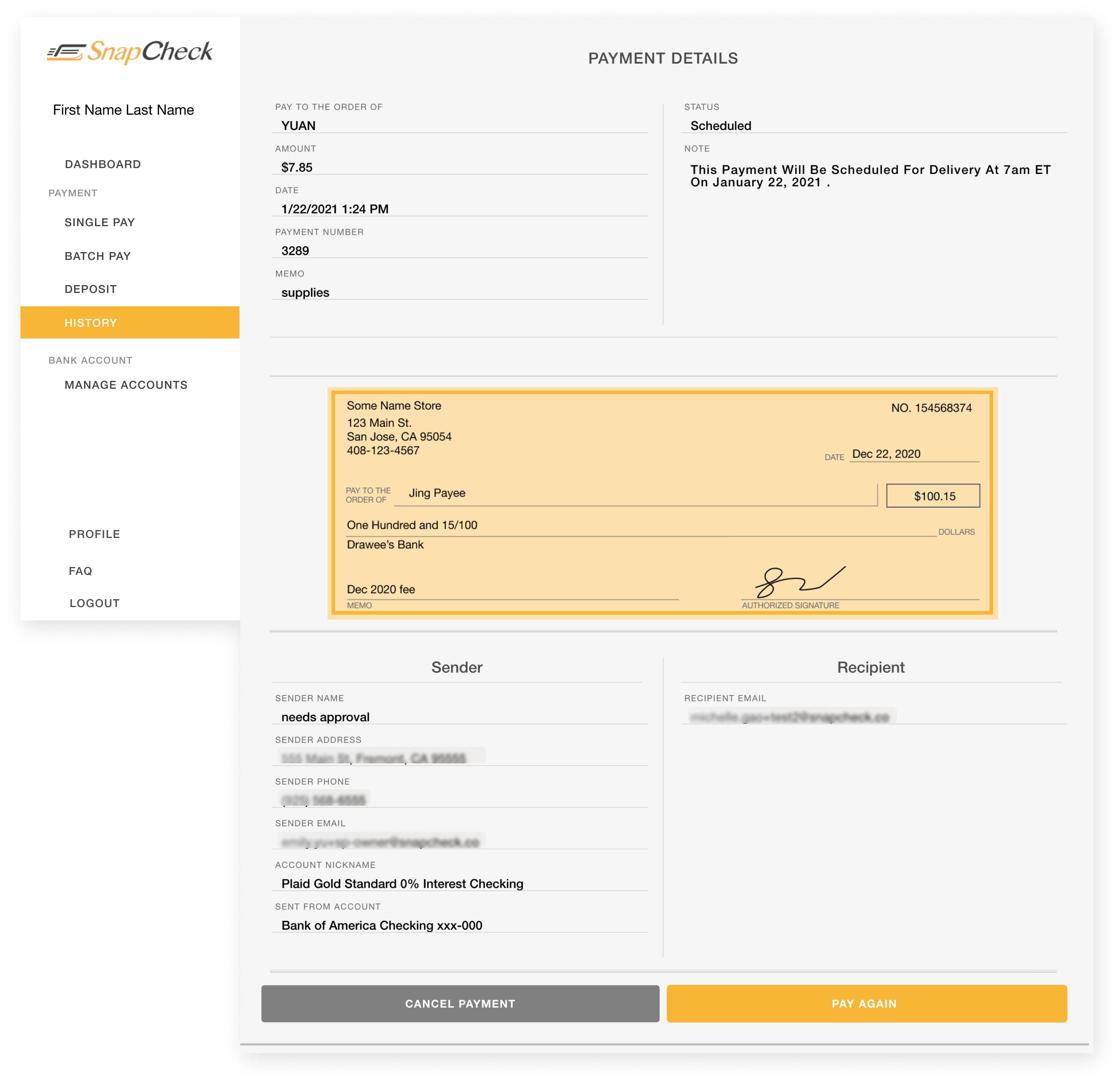
Transaction Details: From Lines to Cards
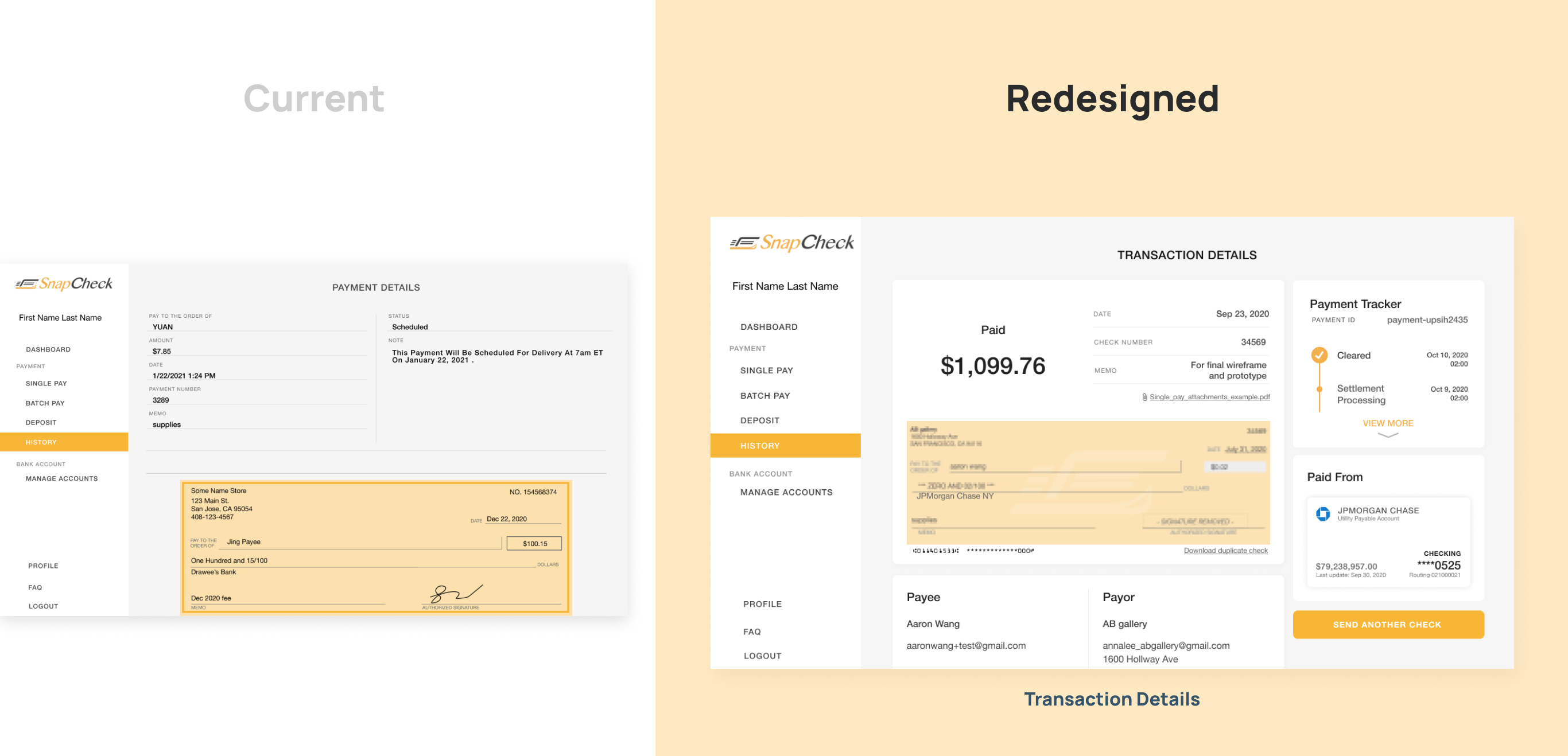
Current
-
Lack of visual hierarchy of payment details. Large empty space above the fold line, sender and recipient information is not easy to browse.
-
No functionality to help users to track payment status history.
-
Payment account information is not displayed on the page.
Redesigned
-
Reorganize the page into four sections(priority top to bottom): Payment info, Payment tracker, Payor & Payee info, and Payment account info.
-
Applied new design system with colors, components, and spacing to use space rationally.
-
Add expandable payment tracker to show the current status and the history which helps users to get full control of their payment.
-
Use column grid system and card style components to display a clean and easy-browse layout.
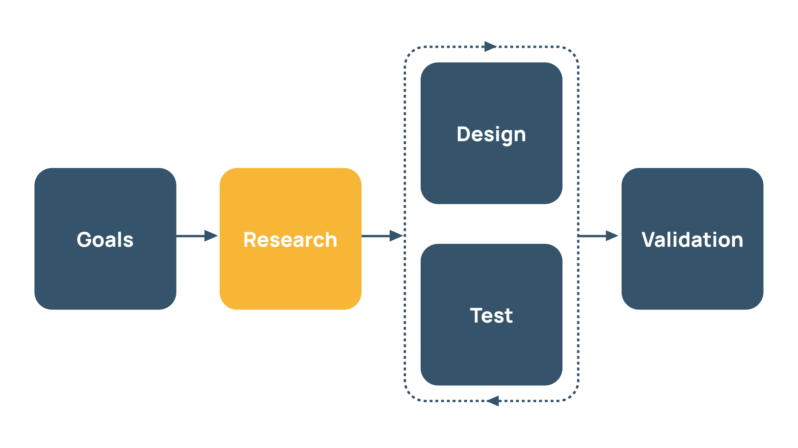
What did I learn from this experience?
1. Well planned schedule and structure when WFH
This is my first virtual project, which started in the middle of the global pandemic. Three designers, 2 engineers, product owners, we only see each other in person two times during the entire process. We communicate every day if needed, we scheduled stand-up meetings every morning via google meet, weekly design review meetings on Friday to summerize this week and set a goal for the coming next, we organized clear file structure in Figma, slab .etc. This all helps us to keep productive when we are all working from home.
2. Deep understand of the project scope and keep in mind.
At the kick-off meeting of this project, we did not quite sure what needs to be improved, what needs to keep the same at the current state, after research and gathered information, then we decide to keep our focus point on the TRANSFORMATION to card style information grouping. That goal is important, especially in a certain short of time, as the agile design process, if we want to make everything perfect and deploy, it makes take forever. Design, test, validate, improve, test, validate, this keeps the product continue moving forward.