Lucent Beauty
User research, testing, and visual identity for an E-commerce mobile application.
Overview
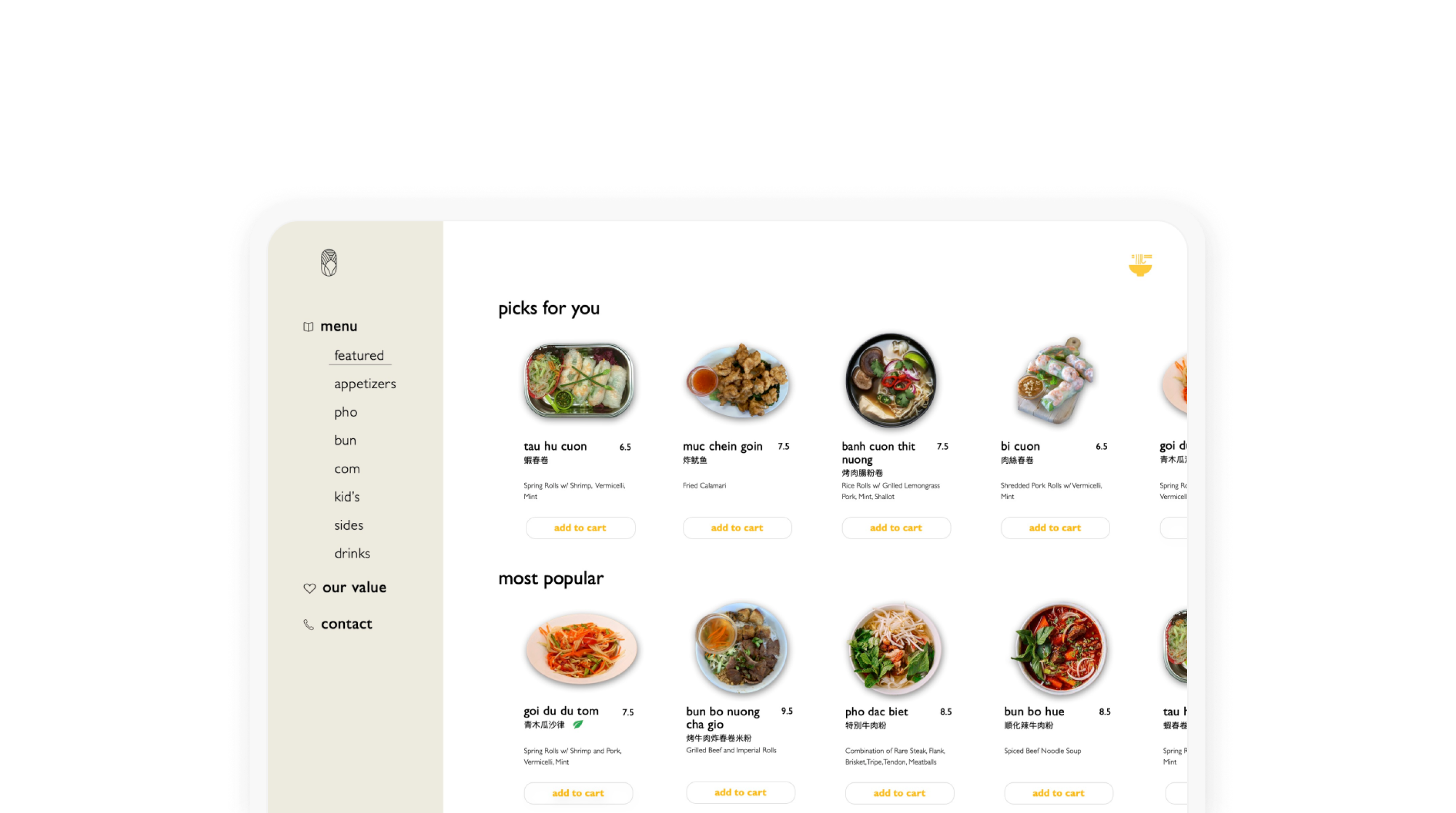
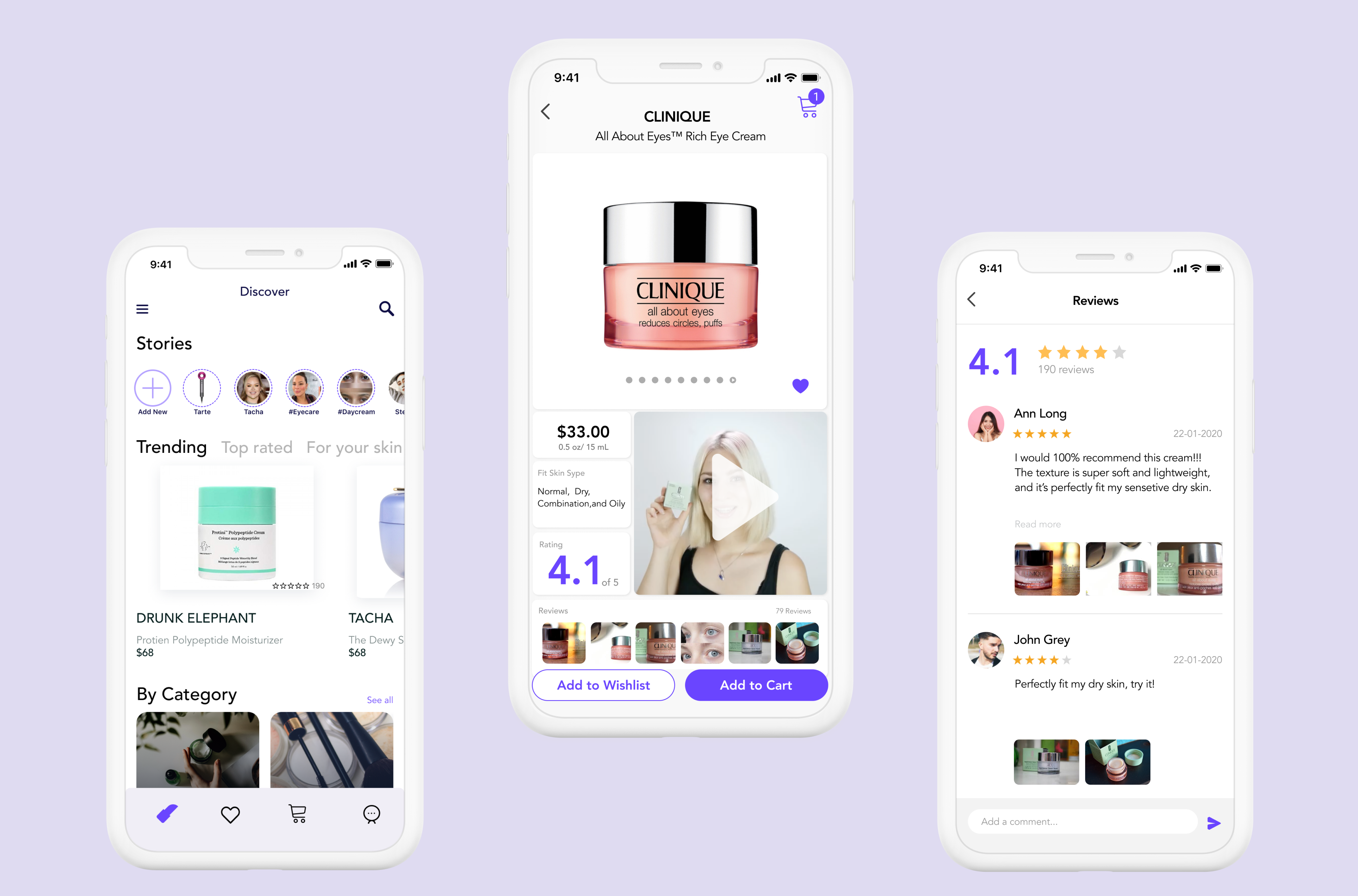
lucent-beauty is an online shopping application that provides selected exclusive products from skincare and makeup professionals with very detailed instructions and reviews.
The goal of this project was to create a beauty shopping application through a full design process that connects potential customers and builds trust with a fluent and accurate shopping experience.
Role
Product design
User research
Methods
Remote Studies, User interview, User journey mapping, A/B Testing
Tools
Figma, Canva, Principle
Why we always buy the "wrong" beauty products?
Users have difficulties understand and get to know beauty products clear and accurately when shopping online, and it turns too hard for them to decide to purchase products.
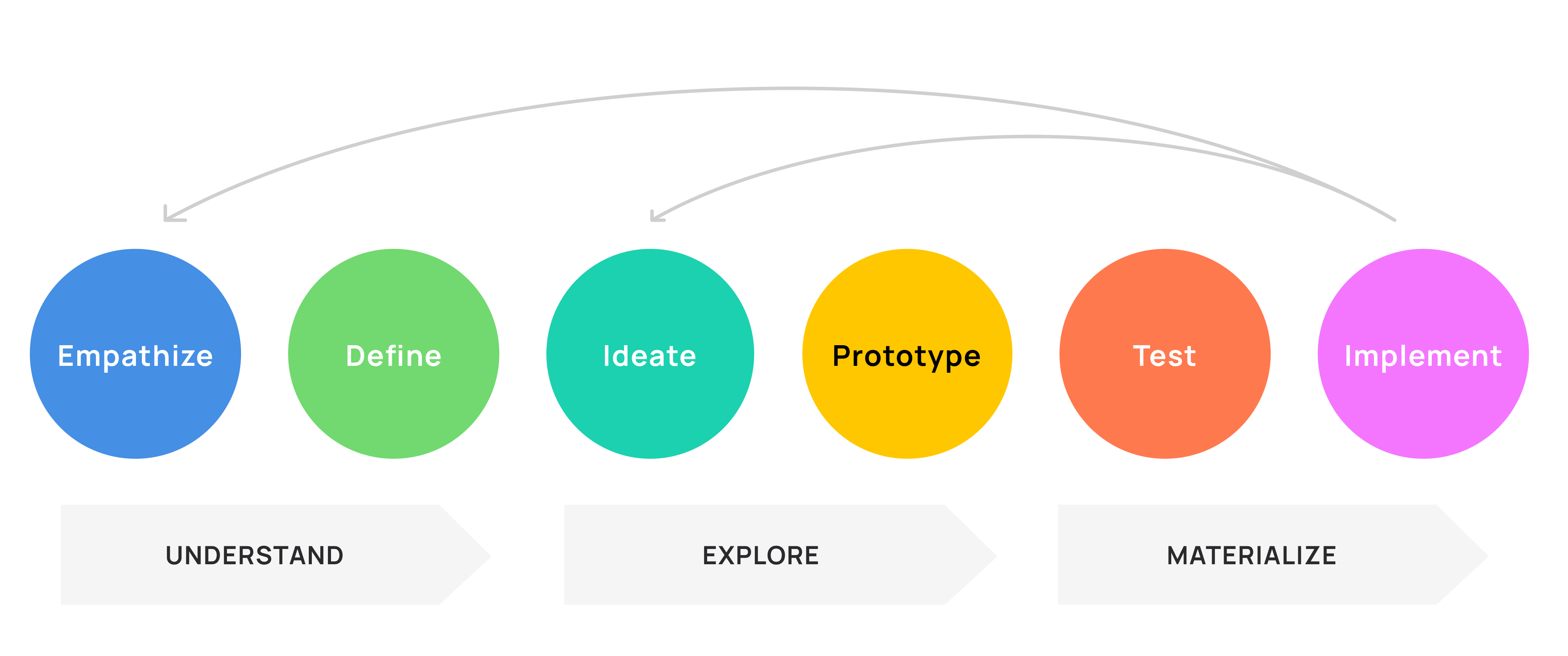
Follow the 3 phases and 6 steps.
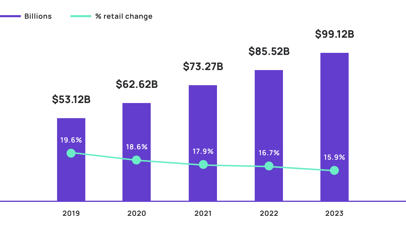
Online Beauty Shopping Business is Boosting.
Globally, E-commerce in the beauty industry is strong and only getting stronger. In the US, all hopes turn to e-commerce.
$483B
Up from $483B in 2020 to $511B in 2021 — and with an annual compounded growth rate of 4.75% worldwide — it’s predicted to exceed $716B by 2025. And $784.6B by 2027.
48%
Although e-commerce penetration has only increased slightly in recent years, the beauty and personal care online share is predicted to surge to 48% in the United States by 2023.
What do users feel frustrated with online beauty shopping?
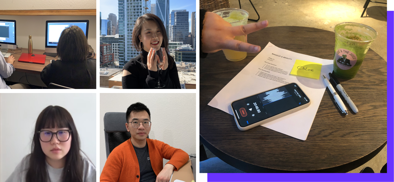
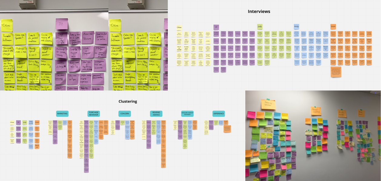
I generated a user interview script with topics, and scheduled individual interviews listen and uncover trends thought and opinions,, and dive deeper into the problem.
Qualitative-User Interviews
During this year in a pandemic, we switched in-person interviews to online zoom interviews. It may lose a little connection because we could not see the interviewee's reaction in real-time due to the distance, it gives the interview more possibility that you may schedule a person that far away from your time zone, only if you feel this helps.
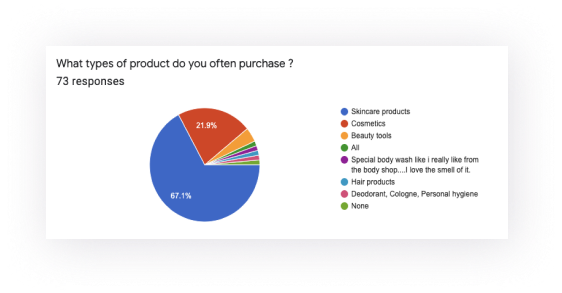
Quantitative-Online Survey
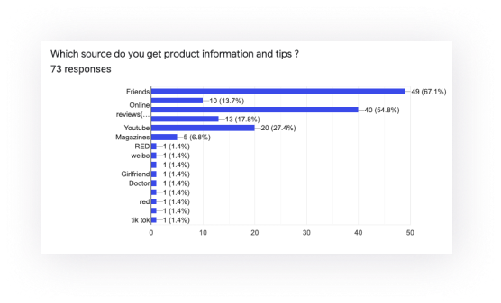
Created and shared the online survey to know more about their online beauty shopping behavior & pain points. Here I took some of the questions that may have key insights we could learn from it.
Multichoice Questions
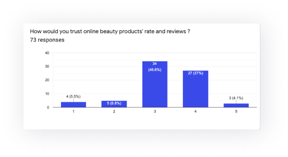
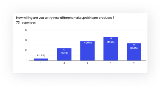
Rating Questions
I got some key insights after collected & organized all the information.

Review accuracy is important
Customers have concerns about the accuracy and accessibility of the product, they want to easily get the true product rating & reviews.

Img & Video could be attractive
Customers have concerns about either the accuracy and accessibility of the product, more or less is due to a large amount of the product database, it’s even harder to find what they fit.

What “fits” me is the best
People care about their image and most challenging part when shop online is they can't find the product fit them.
Who is our potential user?
I set the main user group as millennials around 22-35, who cares about their skin and enjoy a high-quality lifestyle. Then I illustrated the persona and the goals & needs.
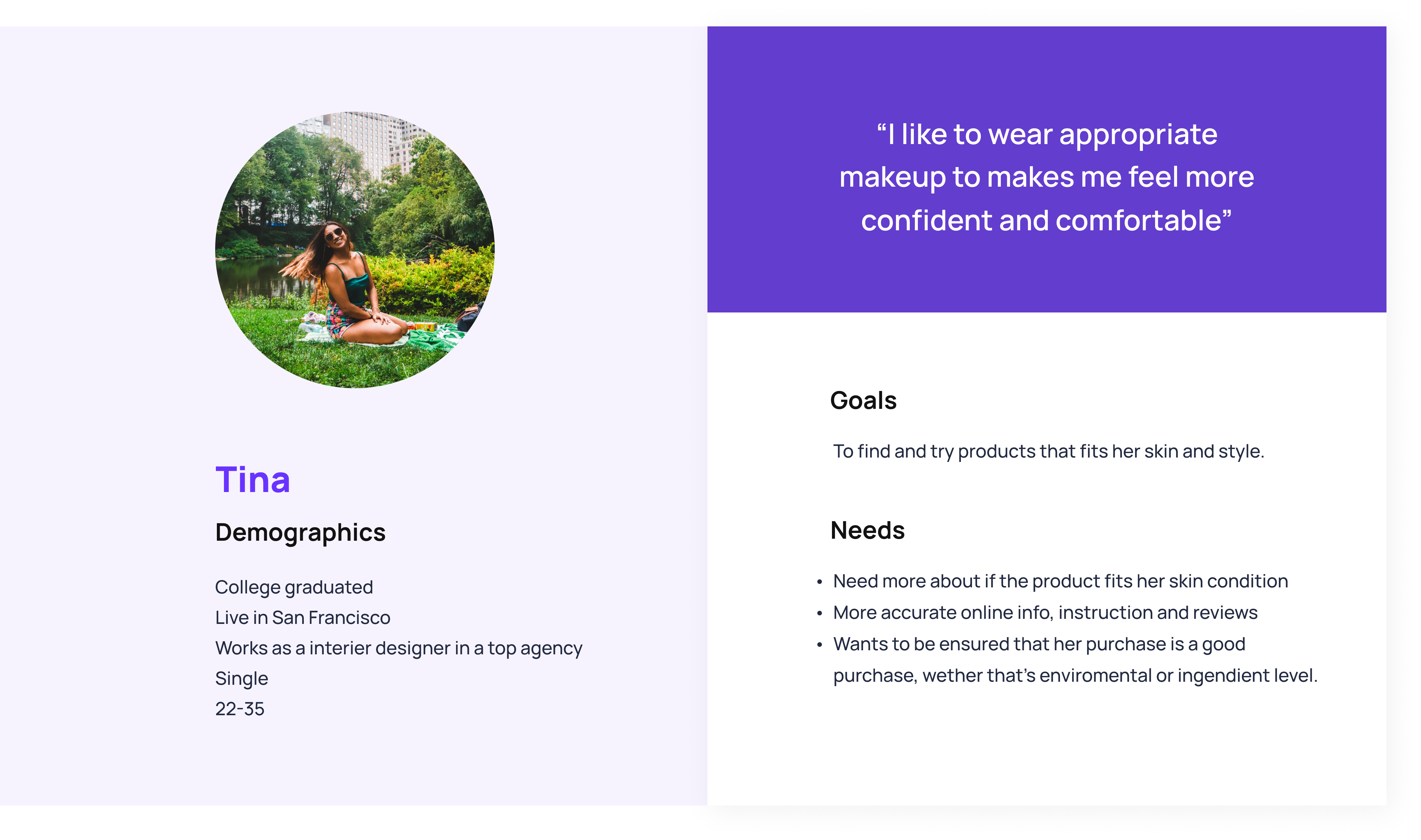
After user interviews, survey analysis, we gain a more real feeling about the needs and problems they have, but more importantly, we know more about their living conditions, working environment, and things happening around them, with these empathetic understanding, we now have the abilities to better solve the problem.
How could we find the best beauty products that fit us?
When users shopping beauty products online, they often feel confused or untrust with the information online which would also disconnect the service and the users, it’s good if we have a solution that helps people choose their fitted products.
How might we enrich the product details & reviews to get users what they want?
Create a selected beauty products e-commerce shopping application with high-quality images/videos and accurate user rating reviews that offers users a concern-free shopping experience to purchase what fits them.
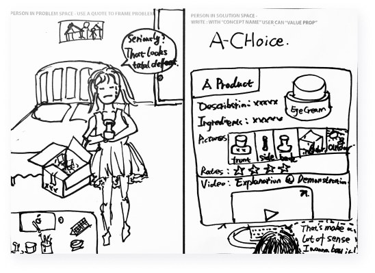
I followed 2 approaches to brainstorm and develop my ideas.
First I put the user in a real context- scenario to think about the questions and opportunities, then I generated the workflows into quick sketch and prototype to see how it works.

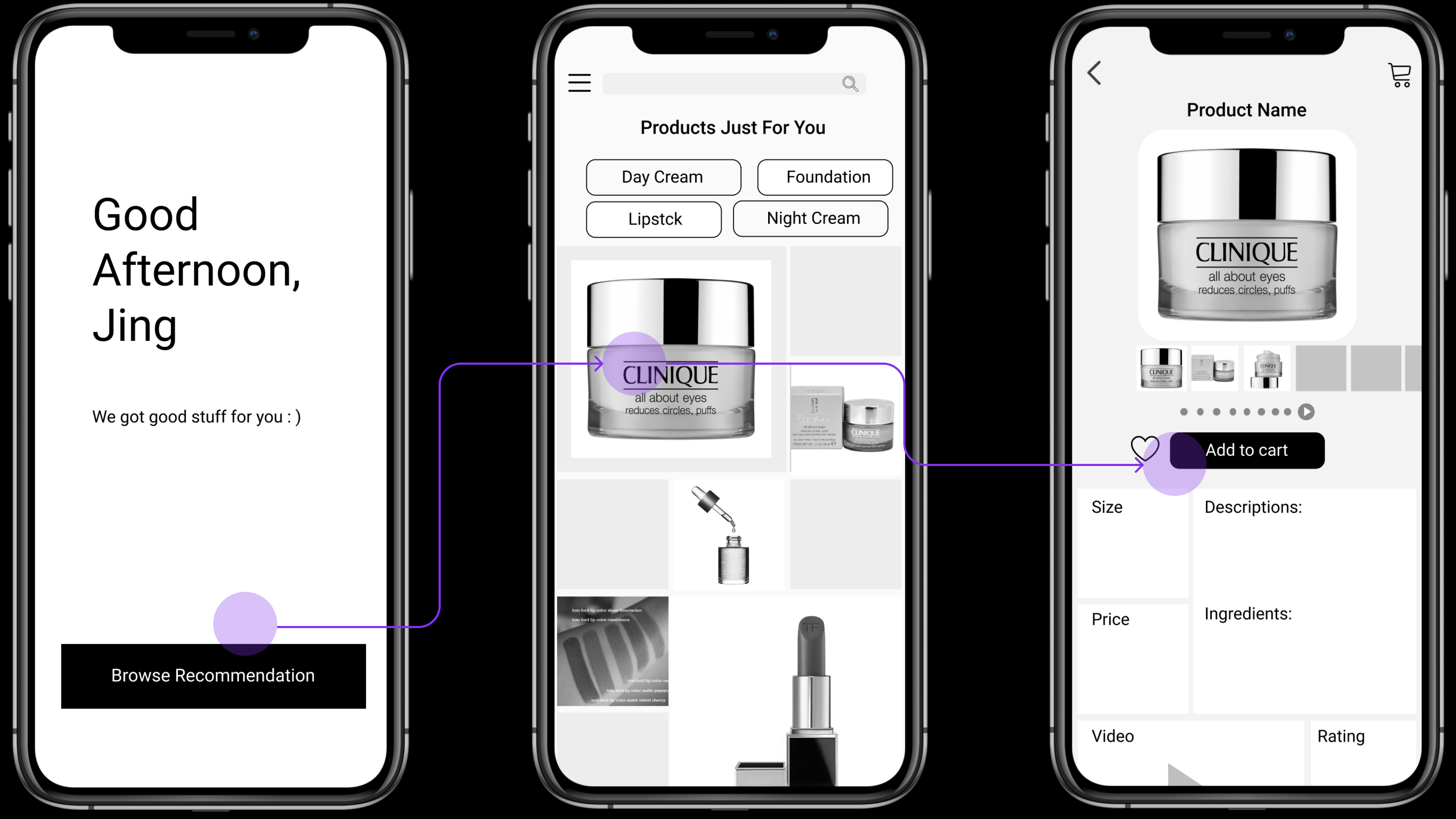
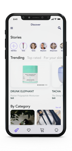
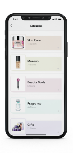
1.Browsing by categories
First idea is about a recommendation section and also the home page user could see every time they open the app, I organized categories as 3 threads for the user to easily find what they want.
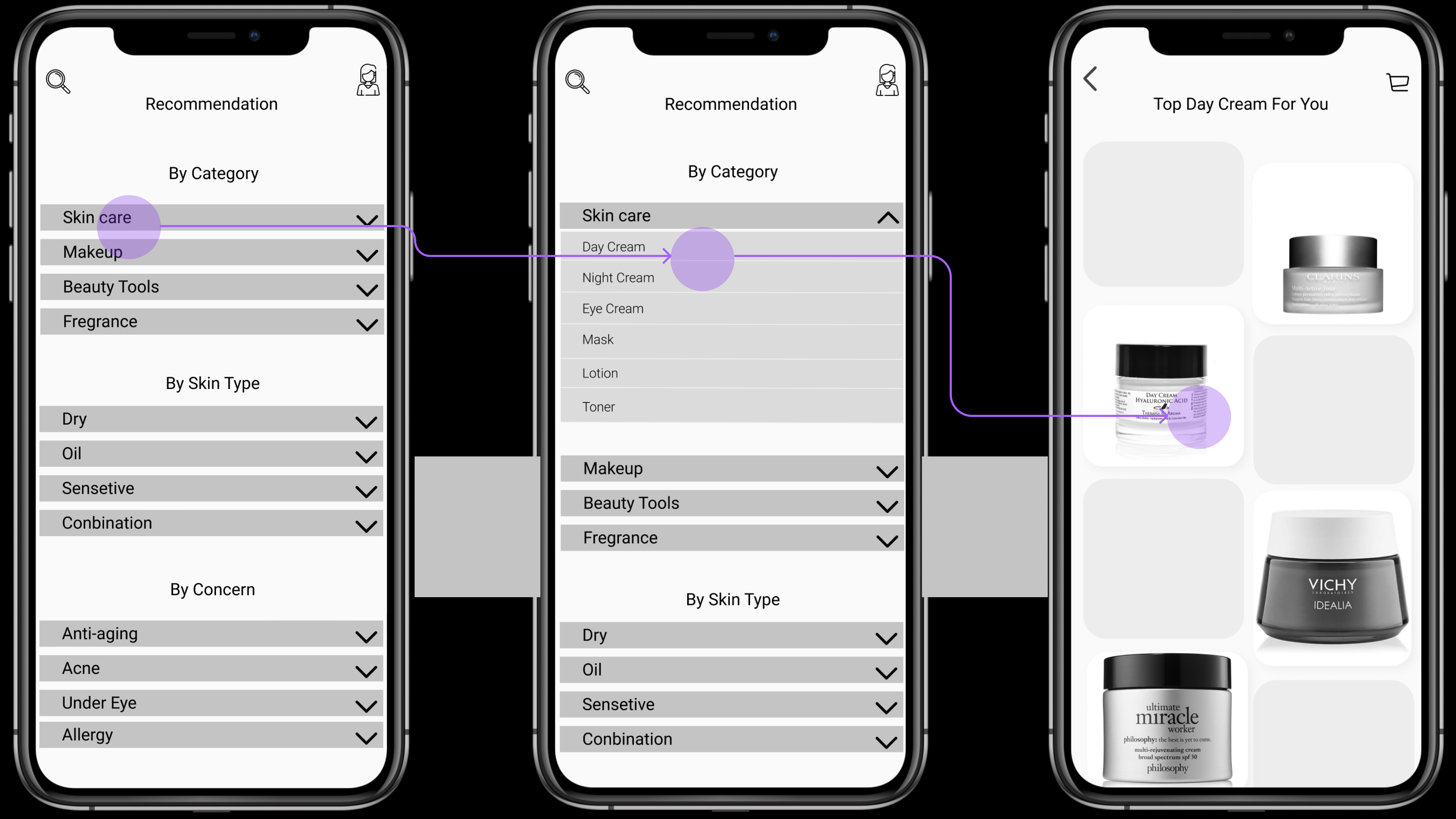
Feedback from testers
Too much content on the first two pages, they want to simplify categories. May need some real product Pictures or Info to interest users.
2.Browsing by personalization
The second one is also a recommendation section but uses a layout that more random for the user to easily browse, for the product info page, we use a column grid to separate space to organize different information for the user to know more about the product.
Feedback from testers
The user was a little bit confuses about the buttons on the second page, maybe include a subtitle. Maybe move category choices on the first page. If the video section is important for the third page, maybe move that section above so users don’t need to scroll down to view it.
I invited the interviewees to play around with my prototypes to gather feedback.
Mainly focus on observing not leading them, only ask for open questions if needed, such as, what do you think this flow should like or guess what it means if they ask about one part that may confuse them, record screen or voice, then organize those feedbacks and questions to each screen.

Zoom Meetings

People

Comments
Synthesis
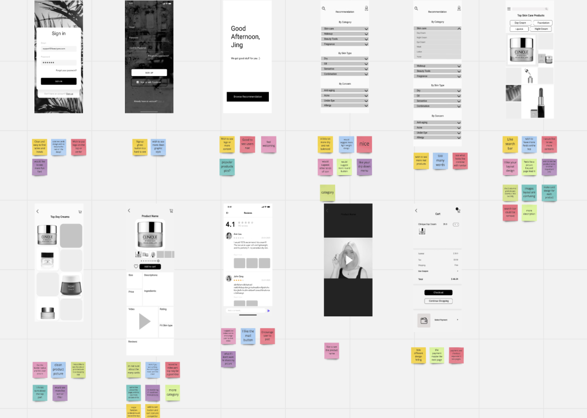
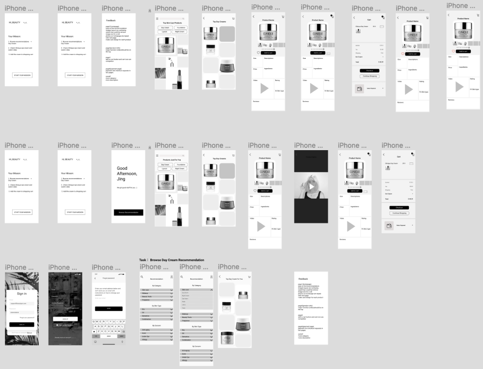
Based on the result of the tests I iterate different versions to improve the experience and test again.
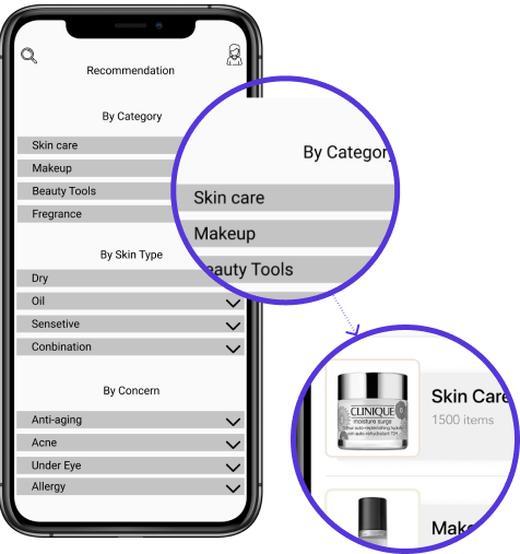
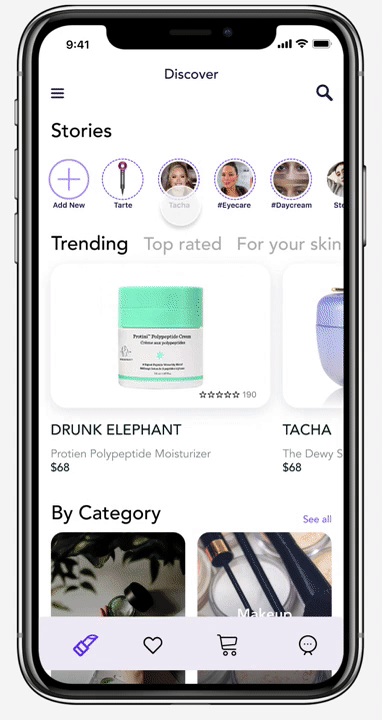
Category navigation
It's good to have a detailed menu or navigation list for the user to organize and easily find what they want, but the problem comes with too much content on one page, and the user could be confused about those category boxes.
Implementation
I switch the detailed navigation to a simple card design.
Product Card
The problem with the product list page is that the products are only images with no name price and other info which is important for a shopping app, and the random grid layout would also confuse users.
Implementation
I changed the design layout from a random picture card to a regular product card with essential information such as name, price, rating, etc.


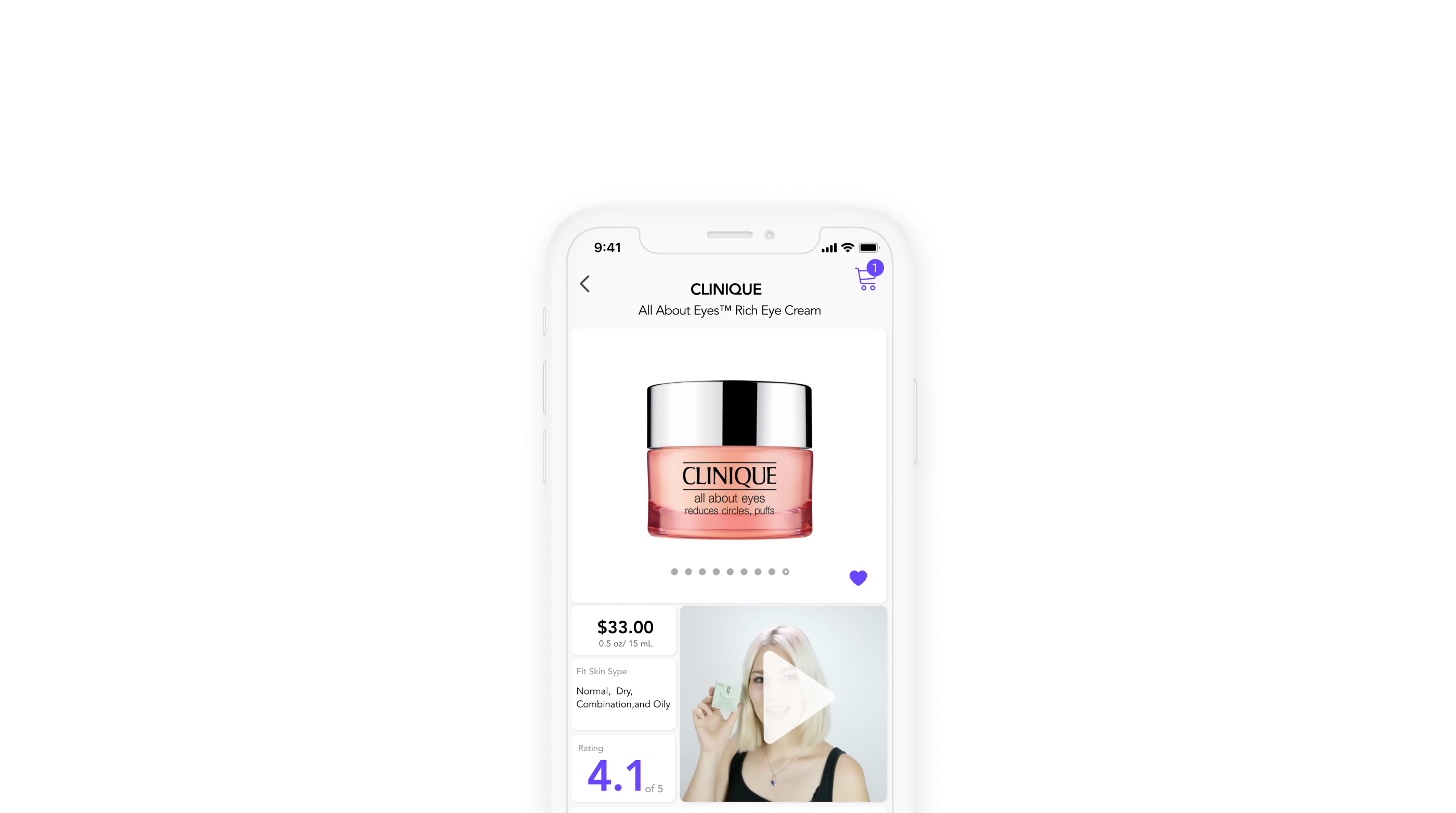
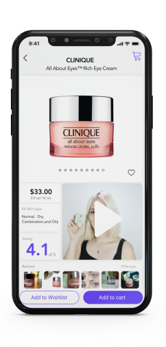
Product Details Page
The problem with this page is that the order of this page is still a traditional e-commerce app feeling, what we learned from the research did not show in this stage.
Implementation
For this page, I revised the order of the information according to priorities and move the reviews, video, and rating part above so users could see the core information without scroll down.
What I came up with from strategy and visual esthetics.


Interactive Prototype
Brand Styleguide